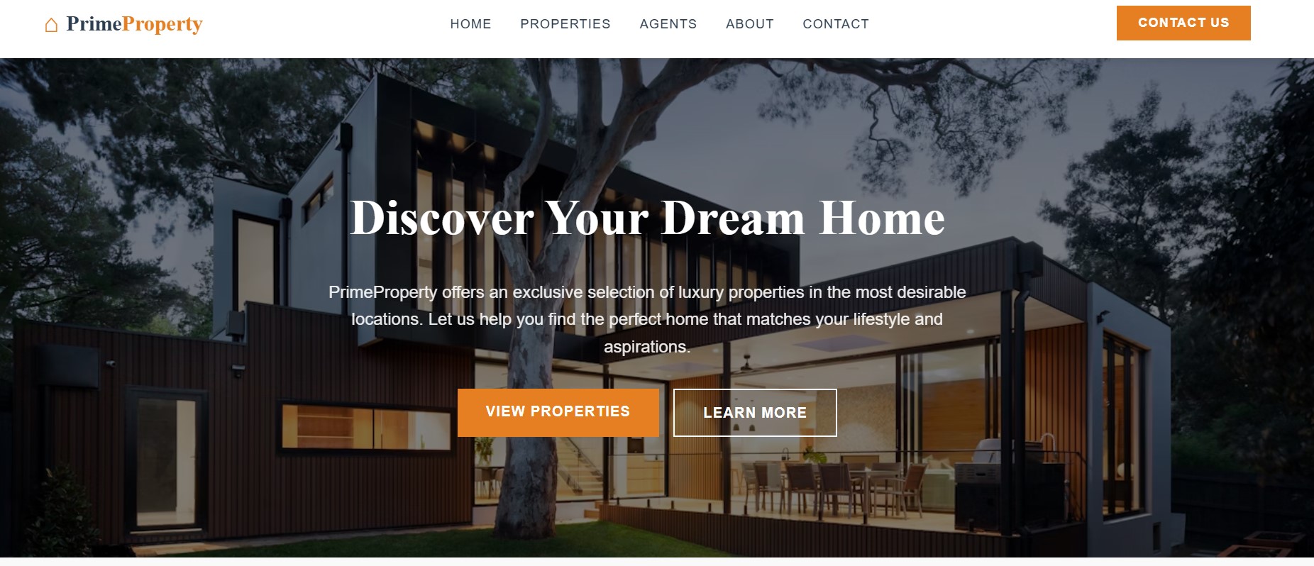
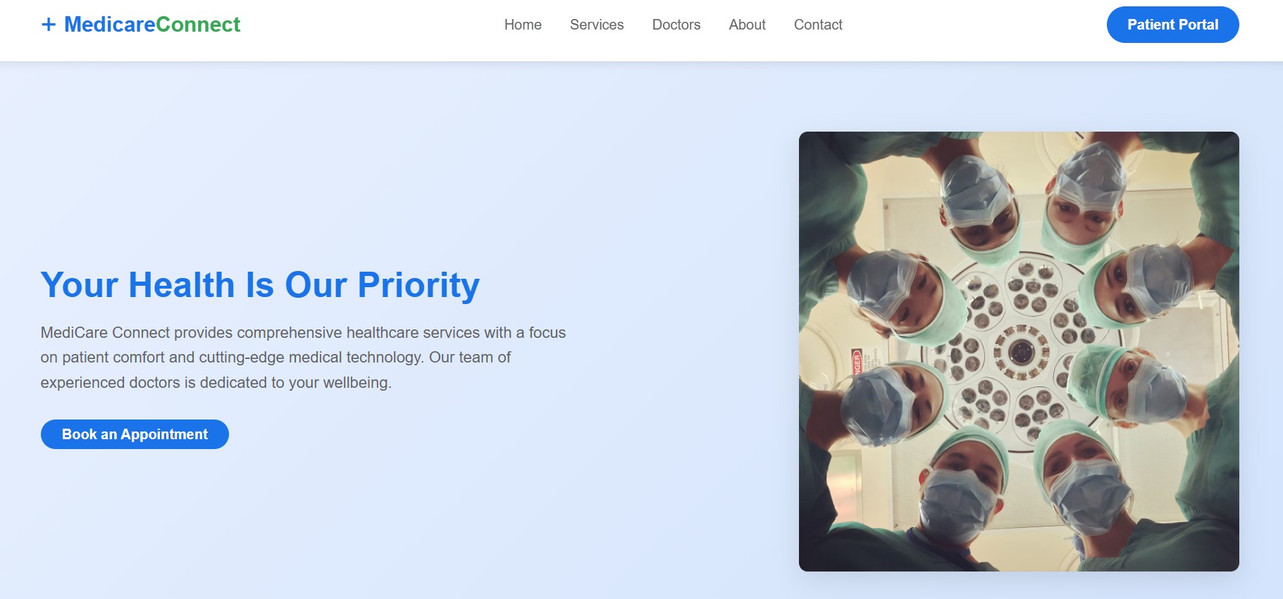
Mobile-Friendly Web Design in Singapore
At RedDot Studios, I create responsive websites that provide an optimal viewing and interaction experience across all devices. With mobile traffic accounting for over 50% of global web traffic, having a responsive website is no longer optional—it's essential.
Why Responsive Design Matters
Responsive design ensures your website automatically adjusts its layout, content, and functionality based on the screen size and device being used. This approach offers several key benefits:
- Improved user experience across all devices
- Higher search engine rankings (Google prioritizes mobile-friendly sites)
- Increased conversion rates and lower bounce rates
- Cost-effective maintenance (one website instead of separate mobile and desktop versions)
- Future-proofing for new devices and screen sizes
My Responsive Design Process
Device Analysis
I analyze your target audience's device usage patterns to understand which devices and screen sizes to prioritize in the responsive design strategy.
Mobile-First Design
I implement a mobile-first approach, designing for the smallest screens first and then progressively enhancing the experience for larger screens.
Flexible Grid Layouts
I create fluid grid layouts that automatically adjust based on screen size, ensuring content is always properly displayed regardless of device.
Responsive Images & Media
I implement techniques to ensure images and media are optimized for different screen sizes and bandwidths, improving load times on mobile devices.
Cross-Device Testing
I thoroughly test the website on multiple devices, browsers, and screen sizes to ensure consistent functionality and appearance across all platforms.
Responsive Design Features
- Fluid grid layouts that adapt to any screen size
- Touch-friendly navigation and interactive elements
- Responsive typography that scales appropriately
- Optimized images that load quickly on mobile devices
- Conditional loading of resources based on device capabilities
- Mobile-specific features (click-to-call, maps integration)
- Performance optimization for faster mobile loading
Why Choose RedDot Studios for Responsive Design
With a deep understanding of responsive design principles and best practices, I create websites that deliver an exceptional user experience across all devices. My approach focuses on both aesthetics and functionality, ensuring your website not only looks great but also performs optimally on everything from large desktop monitors to small smartphone screens.
Based in Singapore, I understand the local market's high mobile usage rates and can create responsive designs that cater specifically to how Singaporeans and international visitors interact with websites on their devices.